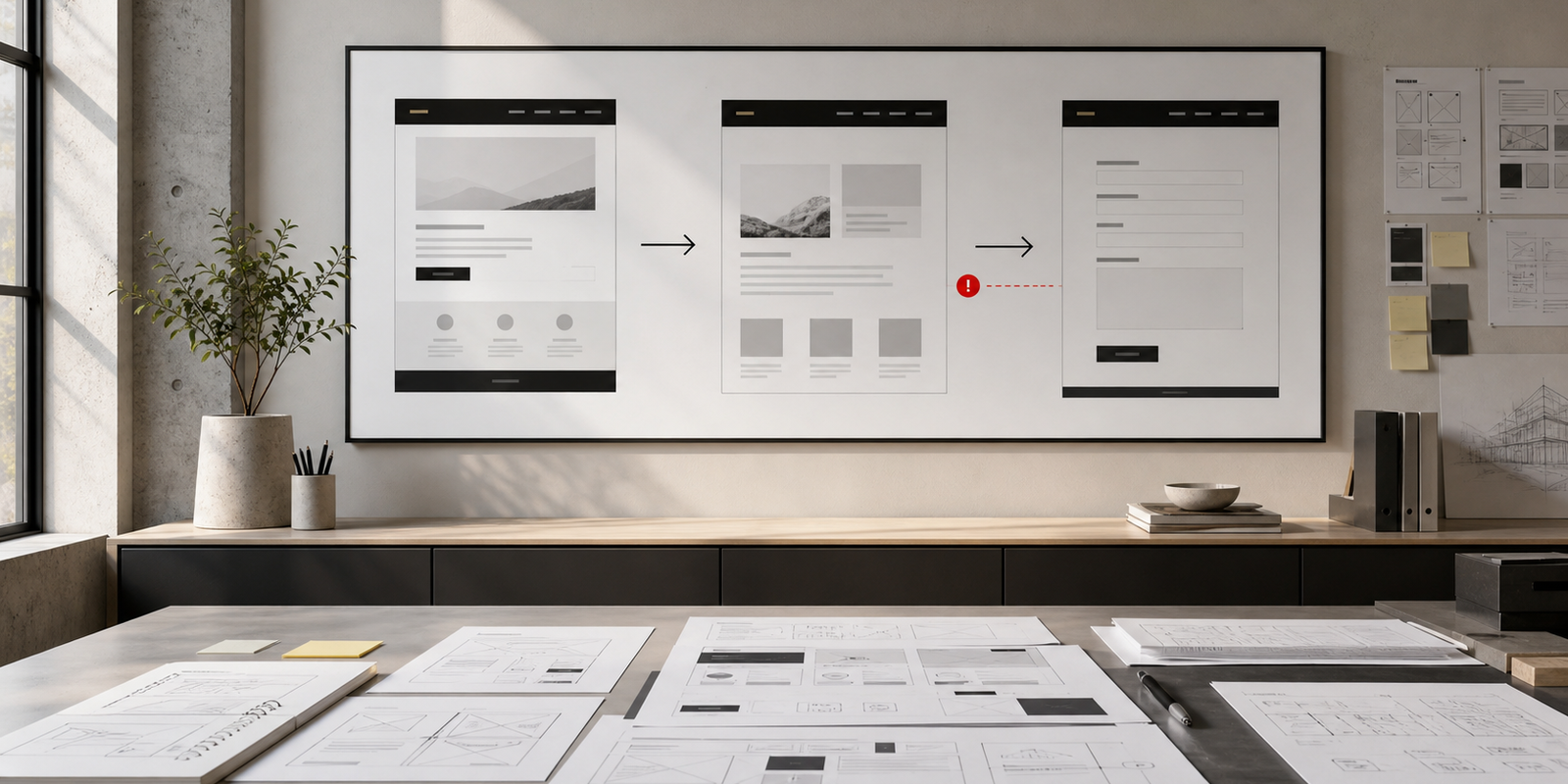
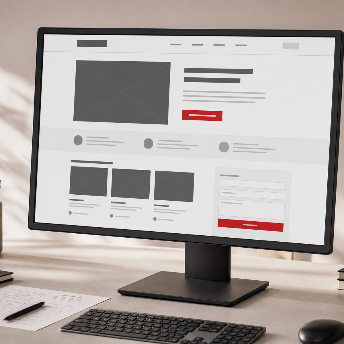
A visitor can understand the offer and believe the proof, then still leave because the next step asks for too much effort. The enquiry path is the distance between interest and contact.
Count the decisions. Does the visitor know where to click? Does the button describe what happens next? Is the form short enough for a first conversation? Are the required fields reasonable? Does the confirmation explain when someone will respond? Every unanswered question adds friction.
Notice
A clear signal tells the right visitor that the page is relevant.
Trust
Proof reduces the risk of taking the next step.
Act
A direct route makes contact feel proportionate to the interest.
The route does not have to be complicated. It may be a short enquiry form, a review request, a call, or a clearly labelled conversation. What matters is that the route is visible, specific, and consistent across the site. A button that says “Submit” creates work for the visitor. A button that says “Book a 20-minute website review” sets an expectation.
That is the difference between a finished website and a working website.
Exposure has approached websites this way for years because the website is not decoration around the brand. It is one of the working touchpoints of the brand system. The same standards that apply to an identity, a package, or a sign should apply here: clarity, consistency, and use in the real world.
If you are reviewing an existing site, start with the structure before commissioning a new visual direction. Our SEO and visibility perspective may also help you assess whether the right people can find and understand the business.
Book a 20-minute website review and we will show you the first gap to fix.
If a stranger cannot find the next step quickly, the issue is rarely the hero image. It is usually the structure, proof, and route.