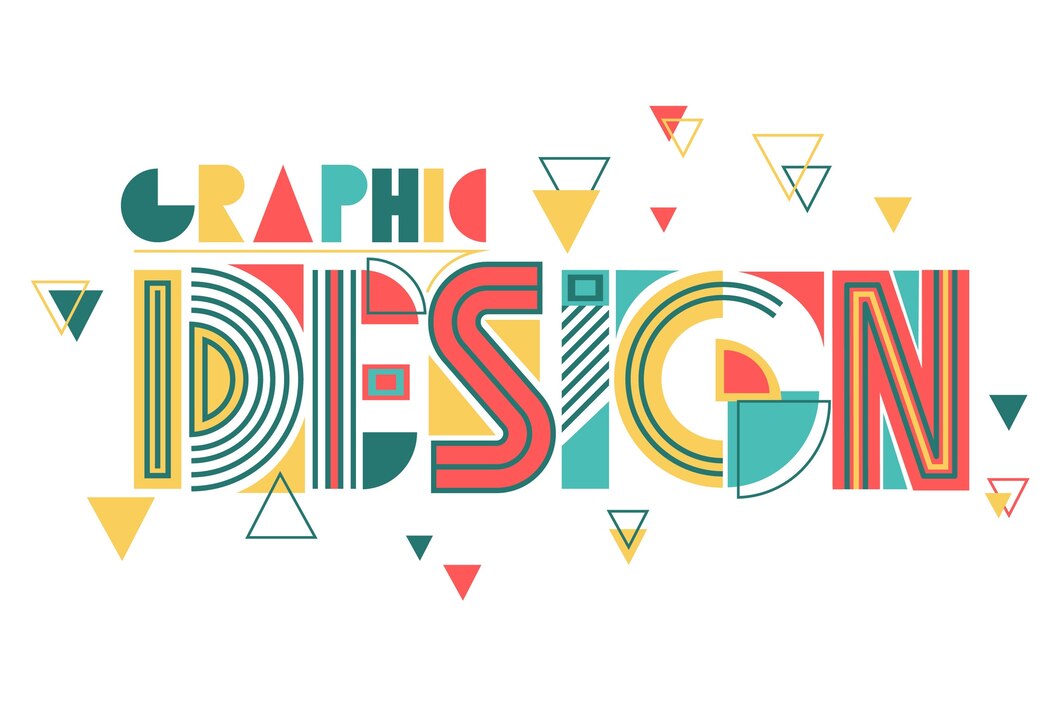
Typography plays a pivotal role in logo design. The font you choose for your brand’s logo can communicate a lot about your brand’s personality, values, and the message you want to convey to your audience. The right typography can make your logo memorable, evoke the desired emotions, and establish a strong visual identity.

Why Typography Matters in Logo Design:
- First Impressions Count: The font in your logo is often the first thing people notice. It sets the tone for your brand and gives an immediate impression of what your brand stands for. For instance, a playful, whimsical font might suggest creativity and fun, while a sleek, modern font might convey professionalism and sophistication.
- Conveys Brand Personality: Typography can express the personality of your brand. Serif fonts, with their traditional and formal appearance, might suit a law firm or financial institution. On the other hand, a tech startup might opt for a sans-serif font to convey a modern and forward-thinking approach.
- Enhances Readability: Beyond aesthetics, typography must ensure that your brand name is easily readable. The balance between creativity and clarity is crucial. A font that is too elaborate may look beautiful but might be difficult to read at smaller sizes or in different contexts.
- Creates a Cohesive Visual Identity: The font used in your logo should align with your overall brand identity. It should complement other design elements like your color palette, imagery, and other branding materials, creating a cohesive and unified brand image.
- Establishes Brand Recognition: Consistent use of typography in your logo and other branding materials helps build brand recognition. Over time, your audience will associate that particular style of typography with your brand, making it easier for them to recognize your brand at a glance.
Choosing the Right Font for Your Brand:
- Understand Your Brand’s Identity: Before choosing a font, it’s essential to have a deep understanding of your brand’s identity. Ask yourself: What is my brand’s mission? What values do we stand for? Who is our target audience? The answers to these questions will guide your font selection.
- Consider Your Industry: Different industries have different expectations when it comes to typography. For example, a law firm might require a more traditional and authoritative font, while a fashion brand might opt for something more elegant and stylized.
- Test for Versatility: Your logo will appear across various mediums—websites, business cards, billboards, social media, etc. Ensure the font you choose looks good and is legible in all sizes and formats.
- Custom Typography: Sometimes, the best way to ensure your logo stands out is to create a custom font. This approach can make your brand unique and differentiate you from competitors. Custom typography allows you to tailor the design to fit your brand perfectly.
- Balance Uniqueness with Simplicity: While it’s important to choose a font that stands out, simplicity is key. A font that is overly complex or difficult to read can turn potential customers away. Aim for a balance where your font is unique yet simple enough to be easily recognizable and readable.
Examples of Effective Typography in Logo Design:
- Coca-Cola: The cursive font in Coca-Cola’s logo exudes a sense of tradition and nostalgia, perfectly aligning with the brand’s long-standing history.
- Google: Google uses a simple, sans-serif font that reflects its modern, user-friendly approach. The color variation adds a playful and approachable touch.
- Vogue: Vogue’s elegant serif font speaks to its high-fashion, sophisticated audience.
Wrap-up
Choosing the right typography for your logo is not just about picking a font that looks good; it’s about selecting a font that embodies your brand’s essence. It’s an integral part of your brand’s visual identity and plays a crucial role in how your audience perceives your brand. So, take the time to explore different fonts, understand their implications, and choose one that resonates with your brand’s values and message.


