Case Study · Consumer · Agro-retail · Project · Full brand engineering
Maasilla
Maasilla - a pesticide-free agro-retail concept by Go Green Agro Foods Pvt Ltd, RS Puram, Coimbatore
A complete pesticide-free agro-retail brand engineered from naming through sustained deployment - identity, FMCG packaging across an extended product line, bilingual storefront and interior environment, category wayfinders, outdoor hoarding, vehicle livery, uniforms, and a running social and print creative programme.
2019
Launched · December
20+
Branded SKUs
2
Languages · English & Tamil
Full
Brand system · identity to fleet

The brief
§01 / Brief
In 2019, almost no Coimbatore retailer was selling pesticide-free, residue-free produce - and making that promise visible enough to believe before you ask. Go Green Agro Foods wanted the whole brand, top to bottom: the name, a mark that works in English and Tamil, the FMCG packaging line, the storefront and signage, staff uniforms, and every piece of launch creative. As the business grew, so did the brief: an outdoor hoarding, vehicle livery across a car and a van, category wayfinder totems inside the store, in-store shelf and price labels, an extended FMCG range covering snacks, pulses, masalas, and olive oil, and an ongoing social media and print creative programme.
The relationship
§02 / Relationship
The engagement started as a project - a complete brand engineering brief executed end-to-end in the months leading up to the 15 December 2019 launch at Father Rhondy Street, off TV Samy Road, RS Puram. Naming, identity, packaging across the FMCG line, bilingual storefront decals, uniforms with PMS-locked colours, the launch advertisement in Kovai Metro, the electronic invite for opening day, the New Year creative that ran straight after. One brand voice, deployed across every artefact a new retail business needed to walk in the door. The work has continued: outdoor hoardings, car and van livery carrying the Support Farmers illustration onto the road, category wayfinder totems inside the store, shelf inserts and price labels, and a growing FMCG line that now includes coconut chips, urad dhal, masala range, and olive oil - all under the same mark, seal, and voice.
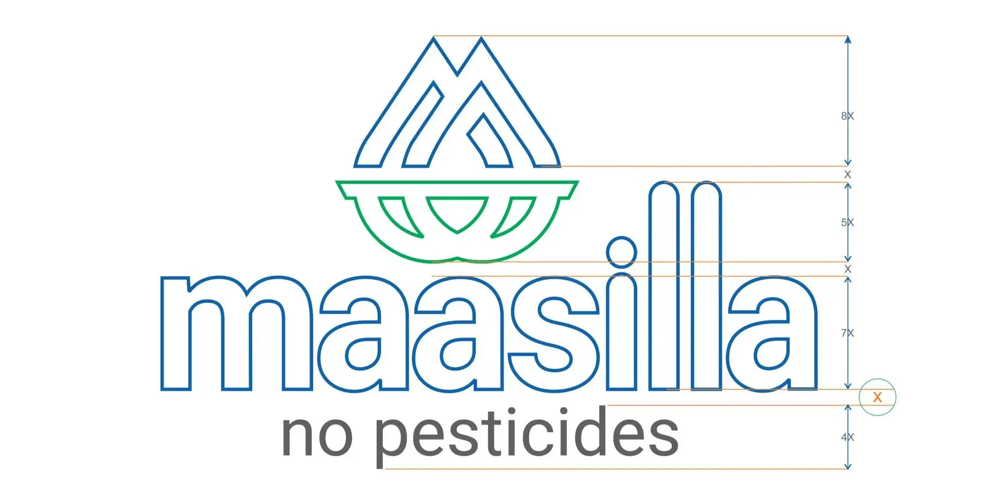
The mark

A mark drawn from the soil and the sky.
Every element of the Maasilla mark carries a meaning specific to the no-pesticide promise. The intro letter - written for retailers, partners, and the first-week customers - explains the symbolism plainly, in the same language the brand uses on the storefront.
- 01
The blue M
A mountain. Terra firma. Drawn in PMS 301 C blue - the colour of earth and sky, the colours customers most associate with cleanliness and trust.
- 02
Green ellipses below
Intertwining earths - soil above and soil below - and water drops. Drawn in PMS 7481 C green to read as growth and expanding horizons.
- 03
Soft round forms
Ellipses and circles chosen over sharp angles to portray calm farm scenery rather than industrial production. Friendship, community, endurance.
- 04
Bilingual wordmark
English maasilla and Tamil மாசில்லா drawn as equal-strength marks so the brand reads natively to both audiences walking into RS Puram.
The work, in parts
§03 / Scope of engagement
01
Naming
Tamil for 'pure and unsullied.' Carried as a bilingual mark - English wordmark and Tamil மாசில்லா at equal strength.
02
Identity
Blue M drawn as a mountain. Green ellipses as intertwining earth and water. PMS 301C + PMS 7481C, codified for print and apparel.
03
The No Pesticide seal
A weight-bearing red ribbon seal reading MAASILLA · NO PESTICIDE · HEALTH WISE. Reads as a quality stamp at thumbnail size on every artefact.
04
FMCG packaging line
Cold-pressed oils in glass with paper-and-blue labels. Spices in green resealable pouches with a clear window. The master mark and No Pesticide seal on every pack.
05
Storefront and environment
Window decals in English and Tamil running the full length of the shop. A backlit signboard above the entrance. Inside, branded green crates and shelving from door to back wall.
06
Uniform system
Blue polo with green collar and cuff, matching cap. PMS specifications shipped with the brand book for consistent reorders.
07
Launch creative
Full-page launch ad in Kovai Metro. An electronic opening invitation. A New Year 2020 follow-up carrying the same brand voice into the first festive moment.
08
Store environment and wayfinders
Category wayfinder totems at each gondola end - Ozonated, Organic - in brand blue on white. Price label inserts, shelf cards, and in-store packed product labels unified under the same type system.
09
Vehicle livery
Car and van wrapped and decaled in brand blue and green. The cow-and-plough Support Farmers illustration and the Farm Fresh Maasilla Assurance badge carried from the packaging onto the fleet.
010
Outdoor advertising
Billboard hoarding at RS Puram announcing the no-pesticide offer and store address. The same editorial brand voice running at roadside scale.
011
Extended FMCG range
Coconut chips, urad dhal, masala range, and olive oil added to the product line. Each pack carries the master mark, the No Pesticide seal, and the Support Farmers illustration - brand voice consistent from launch pack to extension.
012
Digital and social creative
Marketing posters and social media assets in the same editorial format: one hero ingredient, three columns of reason, the no-preservative promise adapted for print and screen.
The work, in pieces
From the crest to the merchandise.
A selection from 2019–2026. Every artefact derived from one master visual system.


.webp&w=3840&q=75)

.webp&w=3840&q=75)


Scope of engagement
One brand system,
across 34 categories.
- Naming
- Bilingual wordmark (English + Tamil)
- Tamil wordmark (மாசில்லா)
- Brand identity & monogram
- No Pesticide health seal
- Farm Fresh Maasilla Assurance badge
- Brand wave graphic element
- Logo construction diagram
- FMCG packaging · oils range
- FMCG packaging · spices range
- FMCG packaging · coconut chips
- FMCG packaging · pulses (urad dhal)
- FMCG packaging · masala range
- FMCG packaging · olive oil
- Storefront fascia signage
- Bilingual window decals
- Interior retail signage
- Category wayfinder totems (Ozonated, Organic)
- In-store shelf labels and price inserts
- Branded shelving & crates
- Staff uniform system (shirt + polo + cap)
- Pantone colour specifications
- Brand book
- Vehicle livery · car
- Vehicle livery · van
- Outdoor hoarding · billboard
- Electronic launch invitation
- Newspaper advertisement (launch week)
- Intro-price launch ad
- Store-opening banner
- Festive creative (New Year 2020)
- Digital marketing posters
- Social media packaging posts
- Cow-and-plough Support Farmers illustration
“Seeding a revolution of no pesticide food retail - named, drawn, packaged, signed, dressed, driven, and announced from one studio.”
Ready when you are
Send us a brief.
We respond in 24 hours.
Complete the Discovery Workshop (guided steps built around the service you need) and our principal team will come back with a call slot, an honest assessment, and a clear first step. No standard pitch, no generic decks.
Discovery Workshop
Guided by service. Built for your brief.
Service-specific questions, not a generic enquiry form. Takes 5 to 10 minutes.
- 01
Pick your service
Logo, website, packaging, or implementation. Select one or more and the brief builds around exactly what you need.
- 02
Choose how to work together
A fixed-scope project or ongoing monthly support. One choice and the form adapts to your model.
- 03
Brief us on your business
Industry, style direction, competitors, and the specifics per service selected. The more detail, the sharper our response.
- 04
We reply within 24 hours
A call from our principal team, not a queue. An honest read of your brief and a clear first step forward.
Or email us directly at info@exposure.co.in